10.1: Notice These Points
Plot the points. What do you notice about the graph?
$(0,10), (1,8), (2,6), (3,4), (4,2)$
Let’s see how graphs of proportional relationships differ from graphs of other relationships.
Plot the points. What do you notice about the graph?
$(0,10), (1,8), (2,6), (3,4), (4,2)$
Some T-shirts cost \$8 each.
Use the table to answer these questions.
| $x$ | $y$ | |
|---|---|---|
| row 1 | 1 | 8 |
| row 2 | 2 | 16 |
| row 3 | 3 | 24 |
| row 4 | 4 | 32 |
| row 5 | 5 | 40 |
| row 6 | 6 | 48 |
Your teacher will give you papers showing tables and graphs.
Take turns with a partner to match a table with a graph.
Pause here so your teacher can review your work.
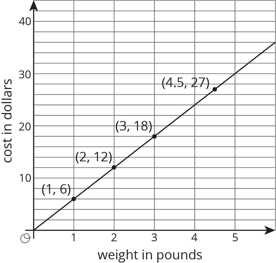
One way to represent a proportional relationship is with a graph. Here is a graph that represents different amounts that fit the situation, “Blueberries cost \$6 per pound.”

Different points on the graph tell us, for example, that 2 pounds of blueberries cost \$12, and 4.5 pounds of blueberries cost \$27.
Sometimes it makes sense to connect the points with a line, and sometimes it doesn’t. We could buy, for example, 4.5 pounds of blueberries or 1.875 pounds of blueberries, so all the points in between the whole numbers make sense in the situation, so any point on the line is meaningful.
If the graph represented the cost for different numbers of sandwiches (instead of pounds of blueberries), it might not make sense to connect the points with a line, because it is often not possible to buy 4.5 sandwiches or 1.875 sandwiches. Even if only points make sense in the situation, though, sometimes we connect them with a line anyway to make the relationship easier to see.
Graphs that represent proportional relationships all have a few things in common:
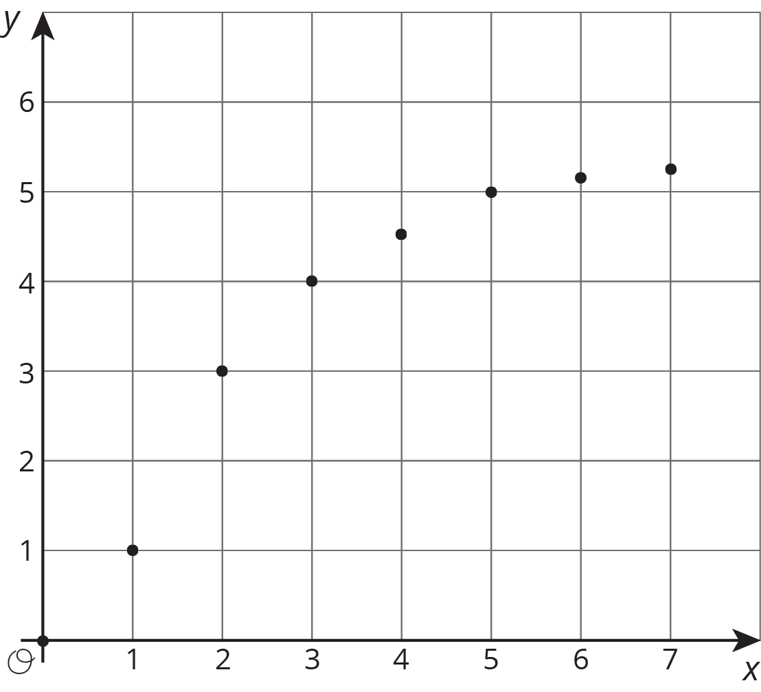
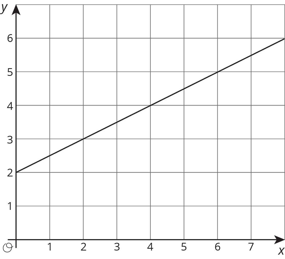
Here are some graphs that do not represent proportional relationships:

These points do not lie on a line.

This is a line, but it doesn’t go through the origin.
In the coordinate plane, the origin is the point $(0,0)$.