Lesson 5: More Graphs of Functions

Let’s interpret graphs of functions.

5.1: Which One Doesn’t Belong: Graphs

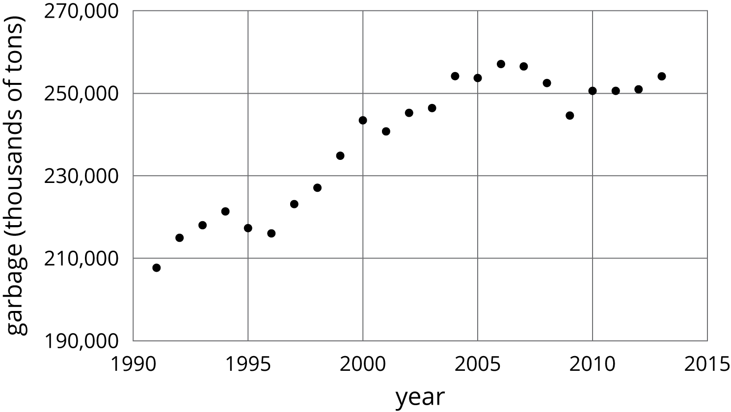
Which graph doesn’t belong?


5.2: Time and Temperature

The graph shows the temperature between noon and midnight in one day in a certain city.
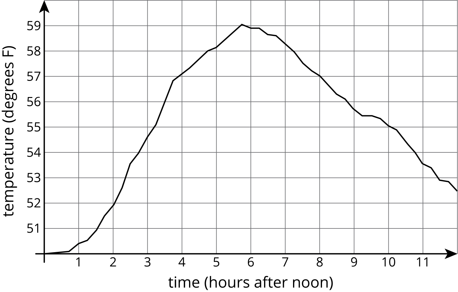
  1. Was it warmer at 3:00 p.m. or 9:00 p.m.?
  2. Approximately when was the temperature highest?
  3. Find another time that the temperature was the same as it was at 4:00 p.m.
  4. Did the temperature change more between 1:00 p.m. and 3:00 p.m. or between 3:00 p.m. and 5:00 p.m.?
  5. Does this graph show that temperature is a function of time, or time is a function of temperature?
  6. When the input for the function is 8, what is the output? What does that tell you about the time and temperature?

5.3: Garbage

  1. The graph shows the amount of garbage produced in the US each year between 1991 and 2013.
    1. Did the amount of garbage increase or decrease between 1999 and 2000?
    2. Did the amount of garbage increase or decrease between 2005 and 2009?
    Garbage Dump Copyright Owner: PublicDomainPictures License: Public Domain Via: Pixabay
    1. Between 1991 and 1995, the garbage increased for three years, and then it decreased in the fourth year. Describe how the amount of garbage changed in the years between 1995 and 2000.
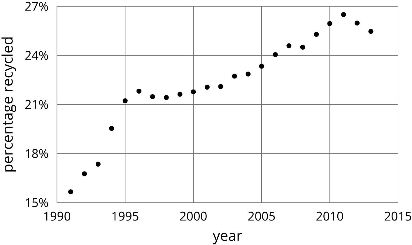
  2. The graph shows the percentage of garbage that was recycled between 1991 and 2013.
    1. When was it increasing?
    2. When was it decreasing?
    3. Tell the story of the change in the percentage of garbage produced in the US over this time period.

Summary

Here is a graph showing the temperature in a town as a function of time after 8:00 p.m.
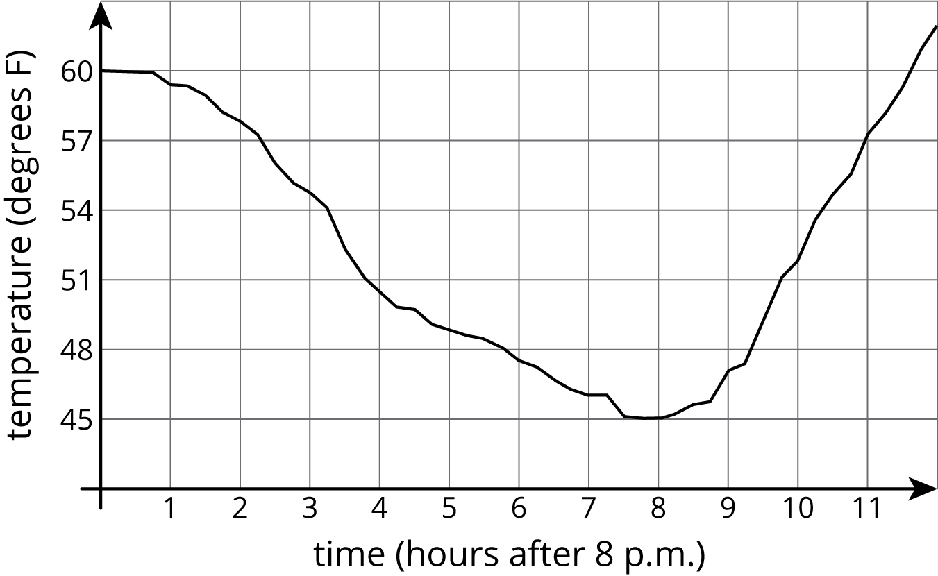
The graph of a curve on the coordinate plane. The horizontal axis is labeled “time in hours after 8 pm” and the numbers 1 through 11 are indicated. The vertical axis is labeled “temperature in degrees Fahrenheit” and the numbers 45 through 60, in increments of 3 are indicated. The curve starts on the vertical axis at the point 0 comma 60, and moves downwards and to the right. It continues downward until reaching a minimum point of 8 comma 45, turns, and then moves upward and to the right, passing through the point 11 comma 57.

The graph of a function tells us what is happening in the context the function represents. In this example, the temperature starts out at $60^\circ$ F at 8:00 p.m. It decreases during the night, reaching its lowest point at 8 hours after 8:00 p.m., or 4:00 a.m. Then it starts to increase again.

Practice Problems ▶