2.1: Representing Data
Lin surveyed 30 students about the longest time they had ever run. Andre asked them about their favorite color. How could Lin and Andre represent their data sets? Would they represent them in the same way? Why or why not?
Let’s collect and display some data about the class.
Lin surveyed 30 students about the longest time they had ever run. Andre asked them about their favorite color. How could Lin and Andre represent their data sets? Would they represent them in the same way? Why or why not?
Are older students always taller? Do taller students tend to have bigger hands? To investigate these questions, the class will gather data.
Each partner should:
| height (cm) | arm span (cm) | hand span (cm) | age (months) | |
|---|---|---|---|---|
| partner A | ||||
| partner B |
One partner records the data from your table in a table of data for the entire class.
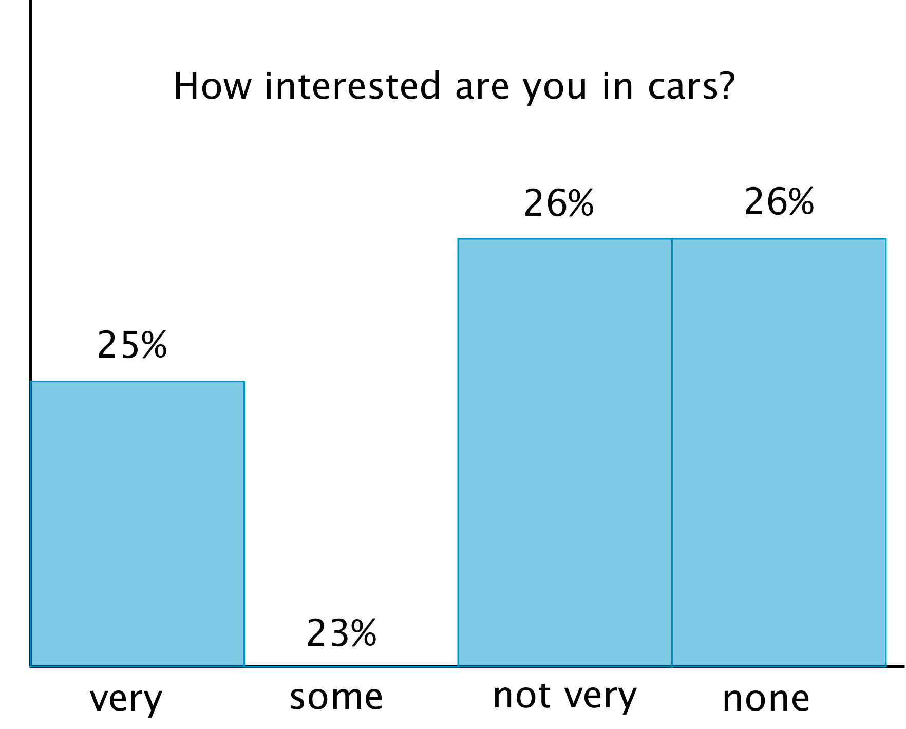
Although the data may be accurate, displaying the data incorrectly can tell the wrong story. What is wrong with each of these graphic representations of the data?


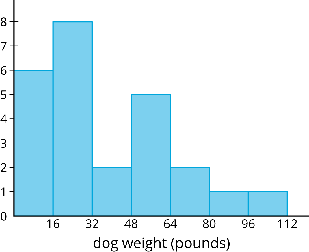
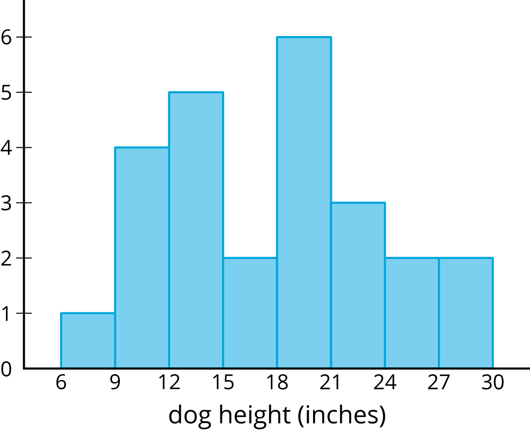
Histograms show us how measurements of a single attribute are distributed. For example, a veterinarian saw 25 dogs in her clinic one week. She measured the height and weight of each dog.
This histogram shows how the weights of the dogs are distributed.

This histogram shows how the heights of the dogs are distributed.

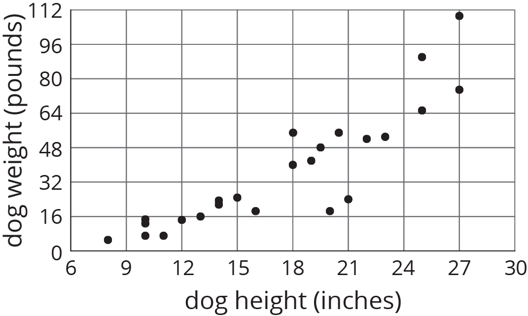
These histograms tell us how the weights of the dogs and how the heights of dogs were distributed. But, they do not give any evidence of a connection between a dog’s height and its weight.
Scatter plots allow us to investigate possible connections between two attributes. In this example, each plotted point corresponds to one of the 25 dogs, and its coordinates tell us the height and weight of that dog. Examination of the scatter plot allows us to see a connection between height and weight for the dogs.
